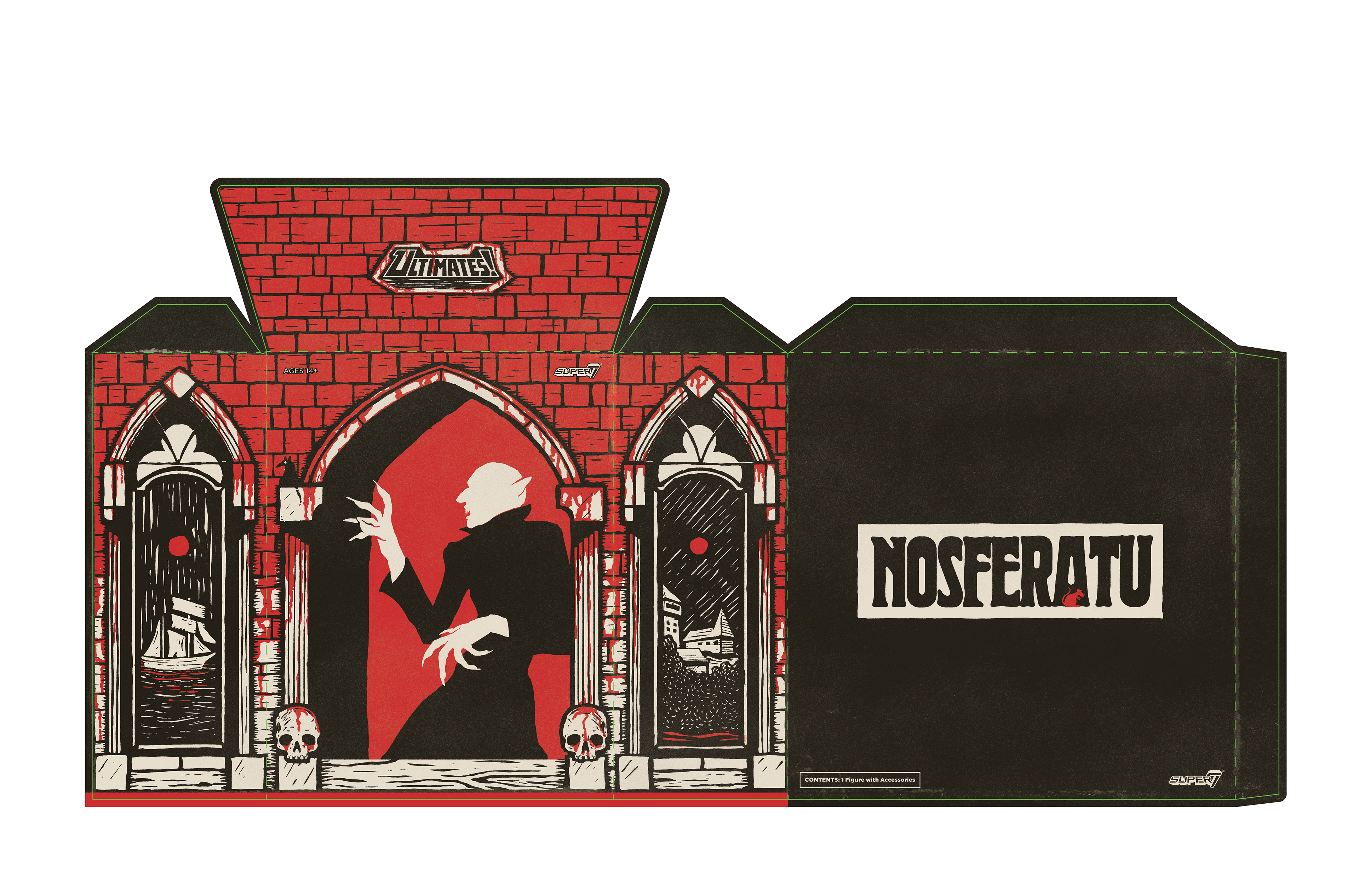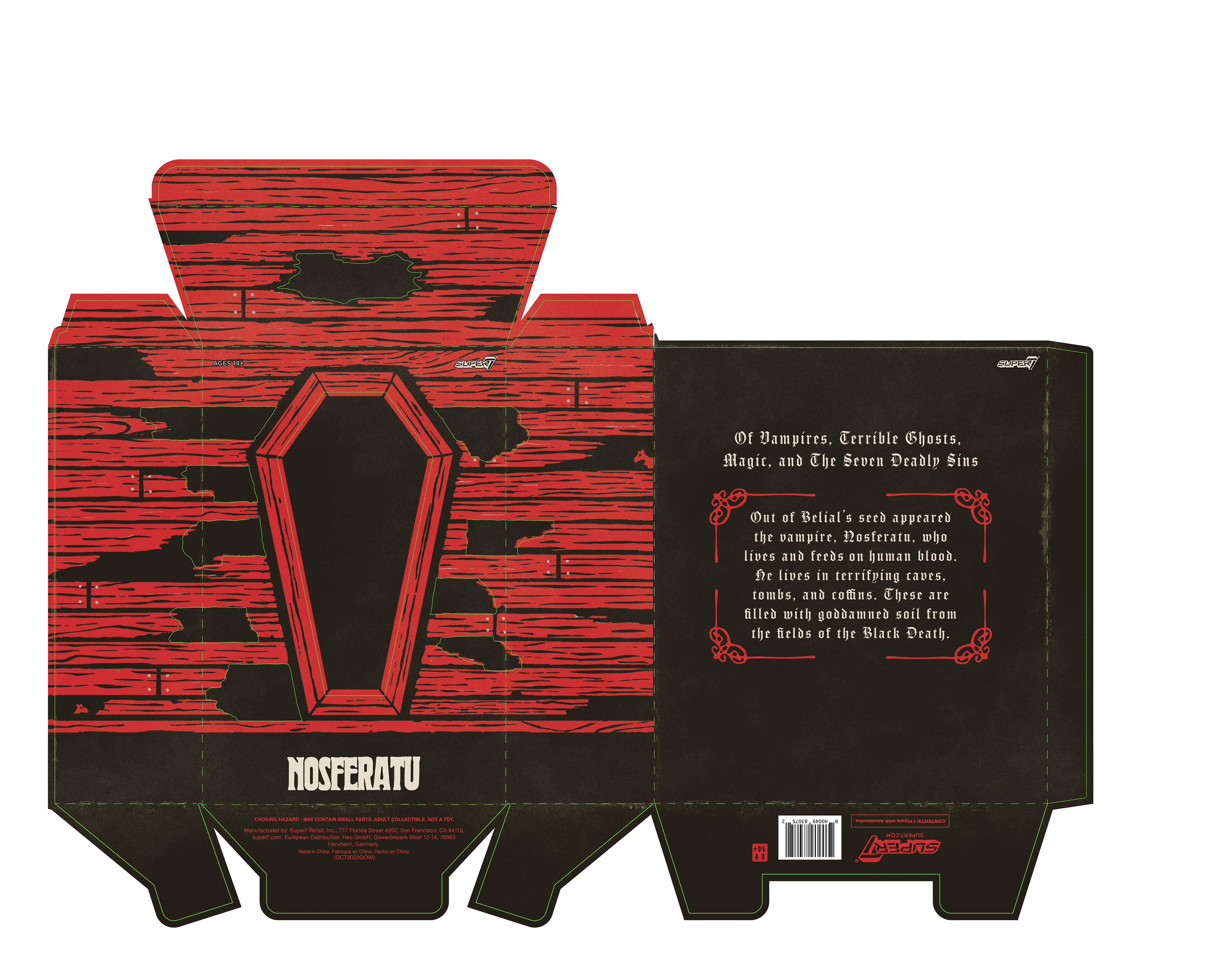
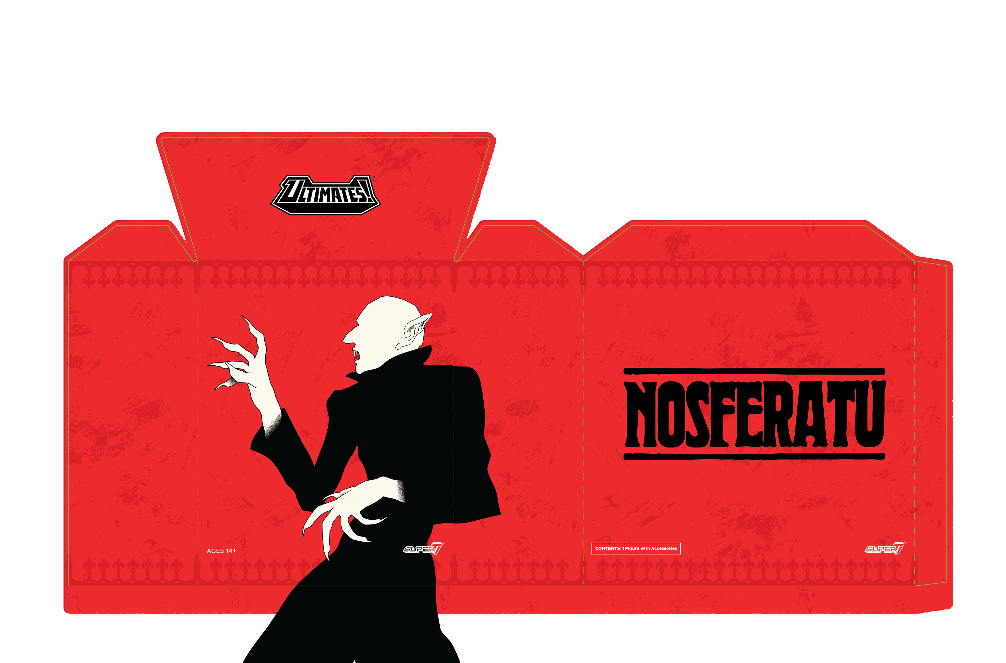
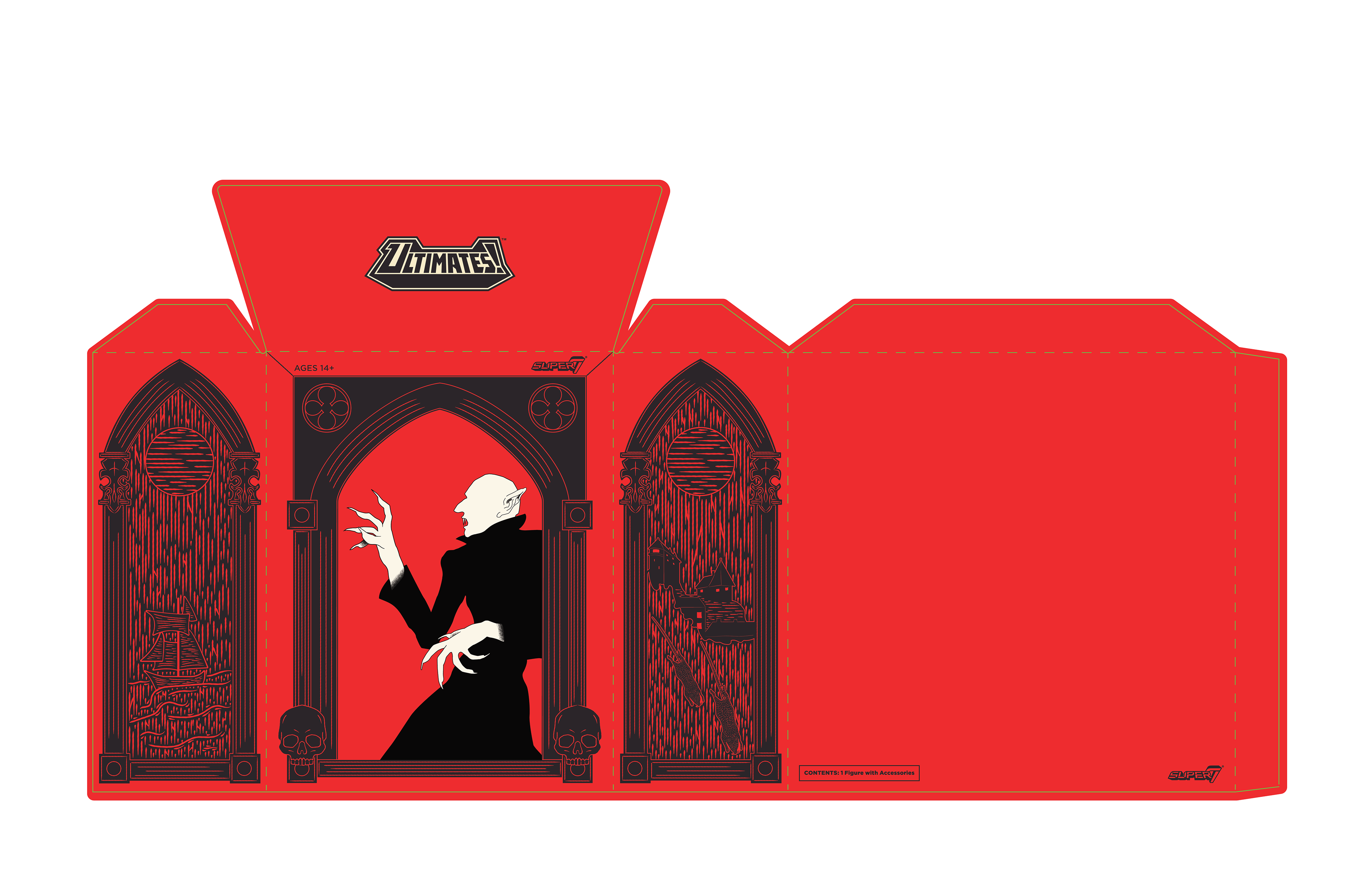
These are the initial package designs that gradually lead to the art style we landed on. The first image was where I fleshed out the color scheme, front character illustration, and the typography on the back of the sleeve and inner box. We knew we wanted to move in a gothic direction to keep in line with the movie, so that was the inspiration. In the two last illustrations you can see that I start fleshing out the relief printing style and begin adding more of the gothic elements to the sleeve.

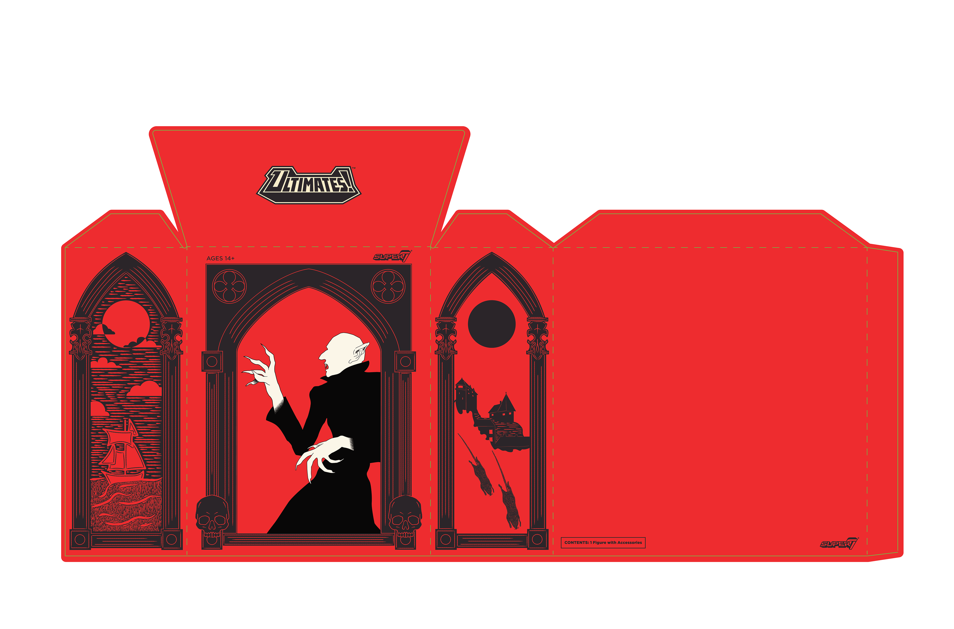
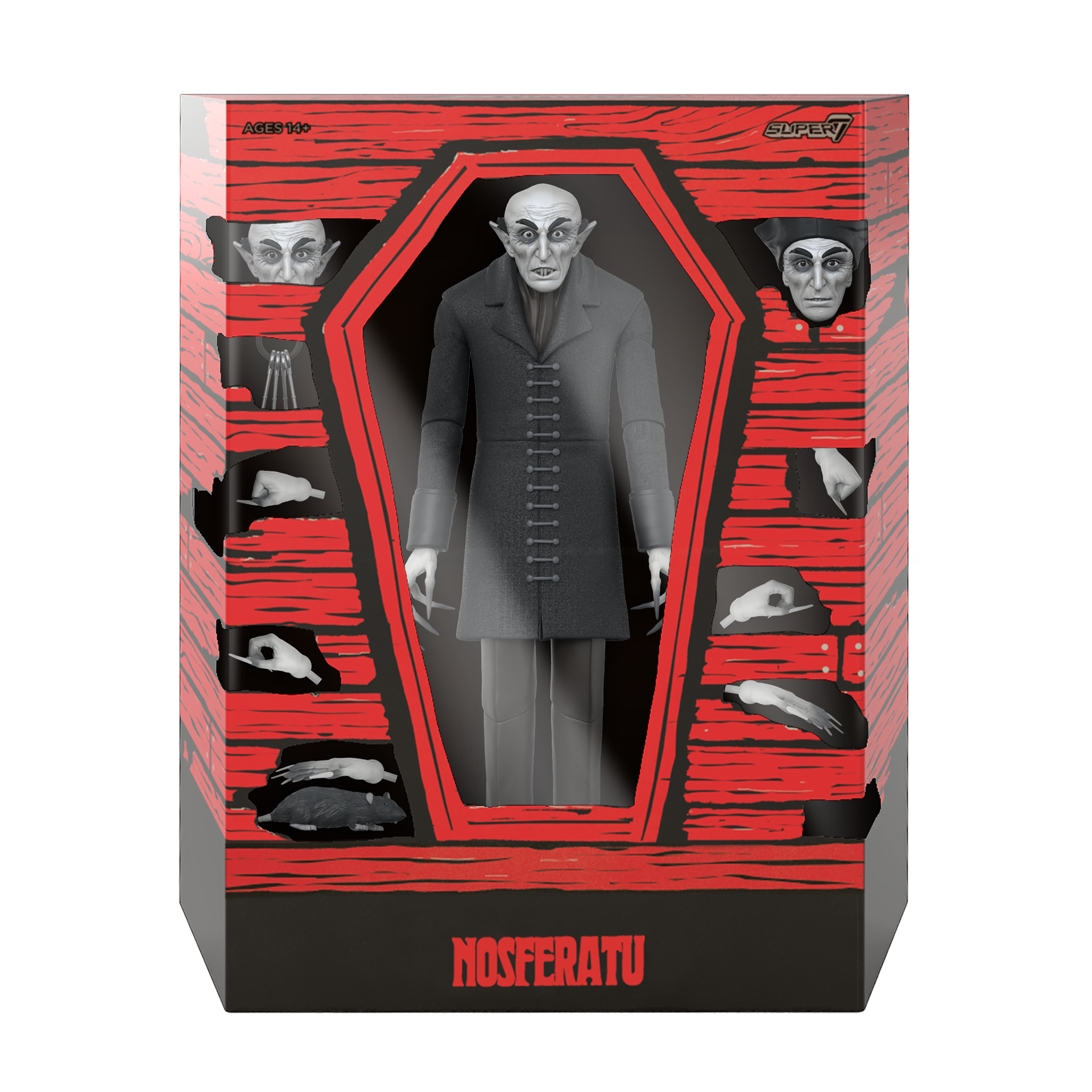
After pushing the illustration and art style into the direction we wanted, I passed it off to somebody to finish the illustration and bring the product to the finish line. The below images are the final product.